This blog will include ideas and tips to make your home comfortable, beautiful and stylish.

Showing posts with label interior. Show all posts

April 1, 2007

Contemporary Style


Contemporary style use straight lines, sculptural elements, art, and bold color. If you love clean, spare, and unique design, this may be the style for you.

Simplicity, subtle sophistication, texture and clean lines help to define contemporary decorating. It is a blend of comfortable, livable elements that create a sophisticated, fresh feel.

Here are some basic rules for you:

Color—Neutrals, black, and white are the main colors in contemporary interiors. The palette is often punched up and accented with bright and bold color. Black is often used to ground and define a contemporary room. With walls painted in a basic neutral, you have a wonderful backdrop for bold colored accessories.

Line and Space--The most obvious and distinctive element of a contemporary style is line. It's found in architectural details, use of bold color blocks, high ceilings, bare windows, and geometric shapes in wall art and sculpture. The bare space, on walls, between pieces of furniture, and above in upper areas, becomes as important as the areas filled with objects.

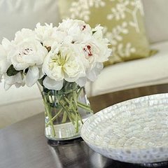
Contemporary Furniture--Smooth, clean, geometric shapes are essential for furniture pieces. Upholstered furniture often wears black, white, or other neutral tones in textured natural fibers. Cover it in a neutral, black, or bold fabric. Fabrics often have a natural look.

Furniture pieces should be simple and uncluttered, without curves or decoration. Sofas, chairs, and ottomans have exposed legs. Beds and chairs usually have no skirt, trim, fringe, or tassels.

Floors-- Should be bare and smooth in wood, tile, or vinyl. If you must use carpet for sound control or warmth, add color and texture with plain or geometric-patterned area rugs.

By focusing on color, space, and shape, your contemporary home can be a quiet and comfortable retreat.


March 29, 2007

How Lighting Affects Color for Home Decorating

Light affects how color appears to us, for instance if you are looking at a block of red color it will change in appearance when exposed to lights of various intensities and types. The same color can appear to transition to another color depending on the light used to view the color. Not enough lighting will further darken a color and too much lighting will wash out a color.

Color & Natural Light : Natural light is generally the predominate home lighting during the day and depending on which direction your windows or glass doors face that will dictate the "color" and "visible temperature" of the natural light that enters your home.

If you have a warm orange-red paint on your living room wall and that room has a window facing west then the orange-red color will become even more vivid after noon. If in that same room the window faces north, the orange-red wall paint will be subdued and toned down because the light filtering in has a bluish cast.

Color & Artificial Light: Day light is supplemented by artificial light in our homes therefore we need to understand their properties. Most fluorescent lights give off a green tinge and can really dull warm colors. There are now fluorescent lights, which have a pink tinge, are more color friendly, and should enhance warm colors. Incandescent light or halogen lighting may cast a yellowing warm light dulling down cool colors. They however will enhance warmer colors.

Considering lighting when selecting colors for paint, wallpaper or fabrics for your home will help you understand how to avoid costly mistakes.

March 28, 2007

How to Effectively Use Color in Your Home


The use of color in your home can be fun and exciting.

Warm colors are known to excite; cools colors to calm. The following is a list described to colors.

  • Red: (think passion) stimulates, arouses, heightens awareness.
  • Blue: (think water; the ocean) relaxes, calms, transfixes.
  • Yellow: (think sun) recharges, energizes, revitalizes.
  • Green: (Blue/Yellow) stabilizes balances.
  • Orange: (Red/Green) cheers, orders.
  • Purple: (Blue/Red) protects comforts.

Warm colors work well in areas where you wish to stimulate conversation and promote interaction. Think lively yellow in the kitchen; demure red in the living room; terra cotta orange in the den. These are rooms where family and friends congregate and interaction is expected.

By contrast, you want to put cool colors in areas where you relax: lavender bathroom; ocean-blue bedroom; forest green study.

Now that you know more about which colors evoke what moods, it should be easier to begin selecting colors that not only fit your design palette, but your emotional palette as well.

February 17, 2007

Shabby Chic


If you like the picture on the left, then you like shabby chic. Shabby chic is a design style deliberately using worn and deteriorated items. Shabby chic items are often heavily painted with many layers showing through obviously worn areas. The style is imitated by painting then rubbing and sanding away the top coat to show the wood or base coats. Fabrics tend to be cottons, with linen being particularly popular, inspired by old French linens. Whites and worn or bleached out pastels are favorite colors. Fabric is often stained with tea to give it the look of old fabric.

Shabby Chic can be anything you want it to be, and is a great way to bring your personal style to any room. Most Shabby Chic decor is based on a white-on-white or beige-on-beige theme. Soft pastels are often used as accent colors, but with a little creativity, you can add just about any color you want. A classic example of Shabby Chic would be to cover couches and overstuffed chairs with white slipcovers, whitewash your wood furniture and hang white airy curtains. Then hang your favorite painting or artwork in the most prominent place in the room. Choose one or two colors in the painting as accent colors, and repeat the colors in throw pillows, flowers, soft throw blankets, and candles. Another great feature of Shabby Chic is the worn and well-loved look. I love its simplicity -- simple color themes combined with your favorite furniture and art.

February 14, 2007

Tips to Fool the Eye—More Tips to Make a Small Space Feel Larger

Here are some more things you can do to make a small space feel larger, even if the floor space stays the same.
  • See-Through Space--By using materials that you can see through, anything beyond will appear farther away, the room is the same size looks bigger.
  • Using mirror to reflective surfaces--Mirror always makes a room feel larger. The space and the light will be reflected for a more open feeling.
  • Using large simple pieces of furnitureA few large, simple pieces of furniture or accessories in place of several smaller pieces. With open space and large blocks of color, the room will appear to be more calm and comfortable.
  • Keep the Upholstery Plain -- Select plain colored upholstery for furniture, Avoid bold plaids, strips or prints. Use texture for interest and stick to neutral tones if you can.
  • Using sheer fabrics—for window treatments, bed skirts, table covers, and furniture slipcovers. Keeping a room look simple.

By using some of these simple rules above, your small space will turn to an intimate space that you like to enjoy most.

Make your small space larger

If you live in a small apartment or home, there are things you can do to make a small room feel more spacious, and less cramped. With color, furniture arranging, and interesting lighting, your space won't feel so cramped. Try some tips here see if it works for you.

Clear Out the Clutter-- Work out ways to get collections out of view, organized behind doors, table skirts, or on shelves. With things neatly arranged and out of sight, the space that is in view will feel orderly and open.

Open the WayDon’t let furniture and accessories blocking the view of a room. Moving furniture out and away from walkways, you'll open up the space and make it feel larger. You can also choose short pieces of furniture like an ottoman, an armless, open chair, or a low table, and place large, tall pieces along a wall rather than out in the open space. If you can see the floor, the room will look larger.

Chooser Soft, Light Hues-- Whereas dark, warm colors make a space feel cozy and intimate, light, cool colors make a space feel open and airy. For optimum effect, select soft tones of blues and greens.

Use single Color Scheme-- Choose colors that are in the same color family. Cool colors and delicate warm colors on most surfaces give the room a more open look.

Coordinate Wall and Furniture Colors-- Pieces of furniture are less interrupting and tend to blend with the space if they're colored to match the wall color. Contrasting colors tend to break up a space.

Let in the Light-- Any room will look larger if it's well-lit, either by natural light or artificial lighting. Get rid of heavy draperies and open up the windows to let the light of the outdoors into the space.

By using soft, snuggly upholstered pieces, dark, warm tones, and dramatic lighting, your tiny corner can become a wonderful private space.


Small is beautiful!

February 8, 2007

5 Keys of Interior Design

5 Key Principles of Interior Design

  1. Balance- Balance gives a sense of repose and a feeling of completion. There are two types of balance: formal balance and informal balance. Formal balance is symmetrical balance that creates a mirror image effect. Informal balance is using different objects of the same visual weight to create a sense of equilibrium in the room.
  2. Emphasis- Emphasis is the focal point of the room. It is where your eyes are first attracted to when you enter the room. You can create emphasis in a room by using line, form, color and texture.
  3. Rhythm- Rhythm helps the eye to move easily from one object to another and creates a feeling of harmony that tells the eye that everything in the room is unified.
  4. Proportion and Scale- Proportion is how the elements within an object relate to the room as a whole and scale relates to the size of an object when compared with the size of the space in which it is located.
  5. Harmony and Unity- Harmony and unity embodies the other elements and principles of design. It is accomplished by repeating the elements, adding a little diversity so that the room has its own sense of personality, and balancing them throughout the room.